Tag On The Go:
Limitless Energy

Tag On The Go:
Limitless Energy

CompanyName

Tag On The Go:
Limitless Energy

CompanyName

Description

Description

Created by Alex Tagliani, ''Tag On The Go'' simplifies your daily life by bringing together everything you need to feel your best, both physically and mentally.

Credits: Remi Beauchamp, Hugo Chiasson,
Benoît Chieusse

Client

Client

Tag On The Go

Tag On The Go

Year

Year

2024

2024

Type

Type

Branding, Multimedia, Marketing

INTRODUCTION

INTRODUCTION

Tag On The Go: A Rush of Energy, A Dash of Style

Tag On The Go: A Rush of Energy, A Dash of Style

When the team behind Tag On The Go approached us, they had a clear vision: a healthy energy drink that fuels active lifestyles with bold energy and sleek branding. From logo creation to motion design, product photography, and a cohesive brand identity, we dove into this project to craft a visual and conceptual universe as dynamic as its ambassador, Alex Tagliani—a race car driver known for his speed and precision. Rooted in the spirit of sport and adventure, Tag On The Go embodies the perfect balance of performance and health, ready to take the market by storm.

Brand statement

Tag On The Go fuels active lifestyles with a healthy energy boost inspired by the speed and precision of Alex Tagliani.

Brand claim

"Limitless Energy" / "Énergie Sans Limite"

Brand values

Performance

Energy

Health

Limitless

COLORS selection

COLORS selection

Colors: The Energy of Red and Orange


Colors: The Energy of Red and Orange


The color palette for Tag On The Go is a bold combination of red and orange—heated tones that embody the brand's vibrant energy and dynamic spirit. Red symbolizes passion, speed, and determination, aligning seamlessly with the world of motorsports and Alex Tagliani's high-octane lifestyle. Orange brings a sense of warmth, vitality, and creativity, connecting to the brand's health-conscious approach and its mission to inspire active, adventurous living.

Together, these colors create a visual impact that is both striking and approachable, echoing the warmth (chaleureux) of the logo design and the personal connection Alex shares with the brand. This palette not only grabs attention but also reinforces Tag On The Go's identity as a brand that fuels ambition and energizes every moment.

The Tag On The Go color palette combines bold red and orange, embodying vibrant energy and dynamism. Red reflects passion, speed, and Alex Tagliani's high-octane lifestyle, while orange adds warmth, vitality, and a health-conscious touch. Together, these colors create a striking yet approachable identity, echoing the logo's warmth and Alex's personal connection to the brand, inspiring active and adventurous living.

Red Cinnabar

#E03333

Poppy Orange

#FF9A17

Cod Gray

#080808

Alabaster White

#fcfcfc

gray scale

gray scale

Grayscale: Versatility in Simplicity


Grayscale: Versatility in Simplicity


Grayscale variations ensure the Tag On The Go branding remains versatile and impactful across all mediums. By focusing on contrast and clarity, the grayscale design maintains the logo's dynamism and readability while adapting seamlessly to diverse applications, from print to digital. This minimalist approach emphasizes the brand's core identity, ensuring it stays bold and recognizable, even without color.

Lightest

Lighter
Lighter
Light
Default
Dark
Darker
Darkest

TYPOGRAPHY DEVELOPMENT

TYPOGRAPHY DEVELOPMENT

Typography: Bold Dynamics and Timeless Precision


Typography: Bold Dynamics and Timeless Precision


For Tag On The Go, typography plays a pivotal role in conveying the brand's energy and professionalism. The combination of Nulshock Bold and Futura PT Medium reflects a perfect balance of dynamism and clarity.

Nulshock Bold, chosen for the title and logo, exudes a futuristic and energetic personality. Its sharp edges and bold, modern styling capture the high-speed essence of automotive sports and the vibrant energy of the brand. It’s a statement font that ensures Tag On The Go stands out with a commanding presence, perfectly aligning with its bold color palette and sporty theme.

Futura PT Medium, used as the corporate font, brings a sense of timeless precision and versatility. With its clean geometric shapes and balanced proportions, it provides a polished and professional look for supporting materials. Its readability and minimalist elegance make it ideal for body text and corporate communication, ensuring a seamless integration across all design elements.

Together, these typefaces create a harmonious visual identity that reflects the brand's energetic spirit while maintaining a sleek, professional edge.

For Tag On The Go, typography is key to expressing the brand's energy and professionalism. The pairing of Nulshock Bold and Futura PT Medium strikes a balance between dynamism and clarity.

Nulshock Bold, used for the title and logo, delivers a bold, futuristic look that captures the brand’s vibrant, high-energy essence. Futura PT Medium, as the corporate font, adds a timeless, professional touch with its clean lines and readability.


Together, these fonts create a cohesive identity that blends sporty energy with polished professionalism.

nulshock
Bold

1234567890-=!@#$%?&*()_-
ABCDEFGHIJKLMNOPQRSTUV
WXYZ

nulshock
Bold

1234567890
-=!@#$%?&*()_-

ABCDEFGHIJ
KLMNOPQRS
TUVWXYZ

Spock Pro Bold is more than just a typeface; it's a statement of strength and authority. With its bold strokes and commanding presence, Spock Pro Bold demands attention and leaves a lasting impression. Whether used for titles, headlines, or standout text, this typeface exudes confidence and sophistication, making it the perfect choice for brands that aim to make a bold statement. Its clean lines and sharp angles convey a sense of modernity and professionalism, while its versatility ensures readability and impact across various design applications. With Spock Pro Bold, Ridge Agency elevates SkriptPC's branding to new heights, capturing the essence of innovation and excellence that defines the brand's identity.

Futura PT
MEDIUM

1234567890-=!@#$%?&*()_-
ABCDEFGHIJKLMNOPQRSTUVWXYZ

Futura PT
MEDIUM

1234567890-=!@#$%?&*()_-
ABCDEFGHIJKLMNOPQRSTUVWXYZ

IMAGERY

IMAGERY

Bold, Healthy, and Impactful


Bold, Healthy, and Impactful


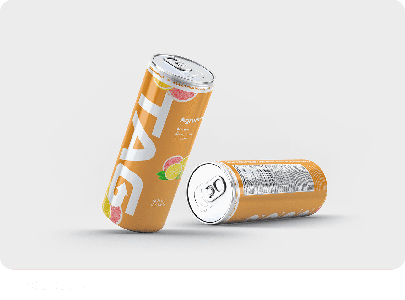
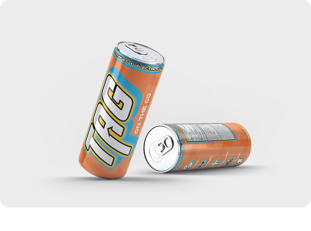
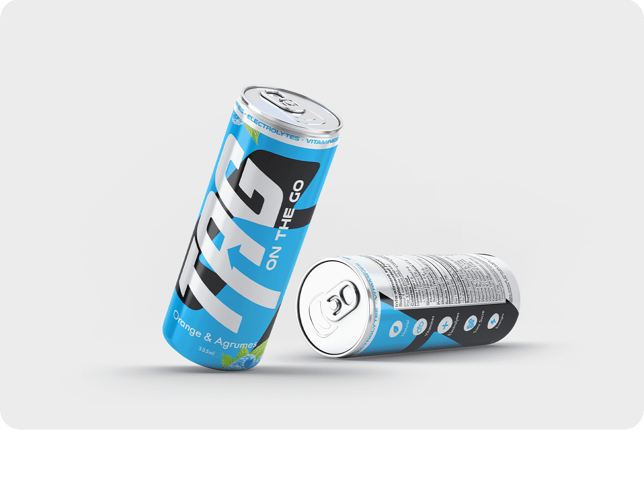
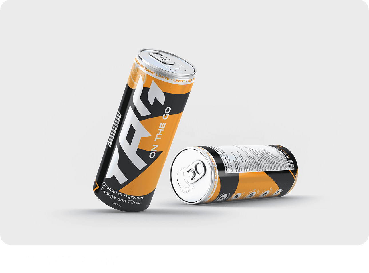
Throughout the project, Tag On The Go’s vision and brief evolved with each new iteration, prompting us to collaborate closely to align our ideas. By merging their input with our creative expertise, we crafted the can design we proudly present today. The result is a dynamic and visually striking design that captures the brand's active spirit while appealing to health-conscious consumers. This bold approach firmly establishes Tag On The Go as a key player in the healthy energy drink market.

Blue

Monday

Blue

Monday

Blue

Monday

branding development

Branding Development: A Dynamic Fusion of Energy and Precision


Branding Development: A Dynamic Fusion of Energy and Precision


The branding for Tag On The Go is a seamless blend of typography, color, and photography, designed to capture the brand's essence of bold energy and professional precision. The Nulshock Bold typeface injects a sense of speed and modernity into the logo and titles, while Futura PT Medium adds balance with its timeless, clean design, ensuring readability and versatility across all corporate materials.

The vibrant red and orange palette amplifies the brand’s identity, symbolizing passion, vitality, and dynamism—qualities that align perfectly with the active lifestyle and high-energy ethos of Tag On The Go. These heated tones not only grab attention but also reinforce the personal warmth of the branding, connecting it back to Alex Tagliani’s story.

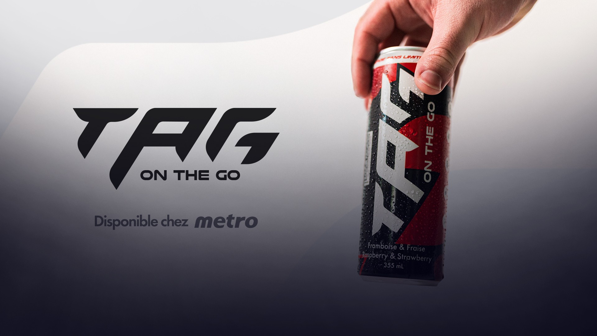
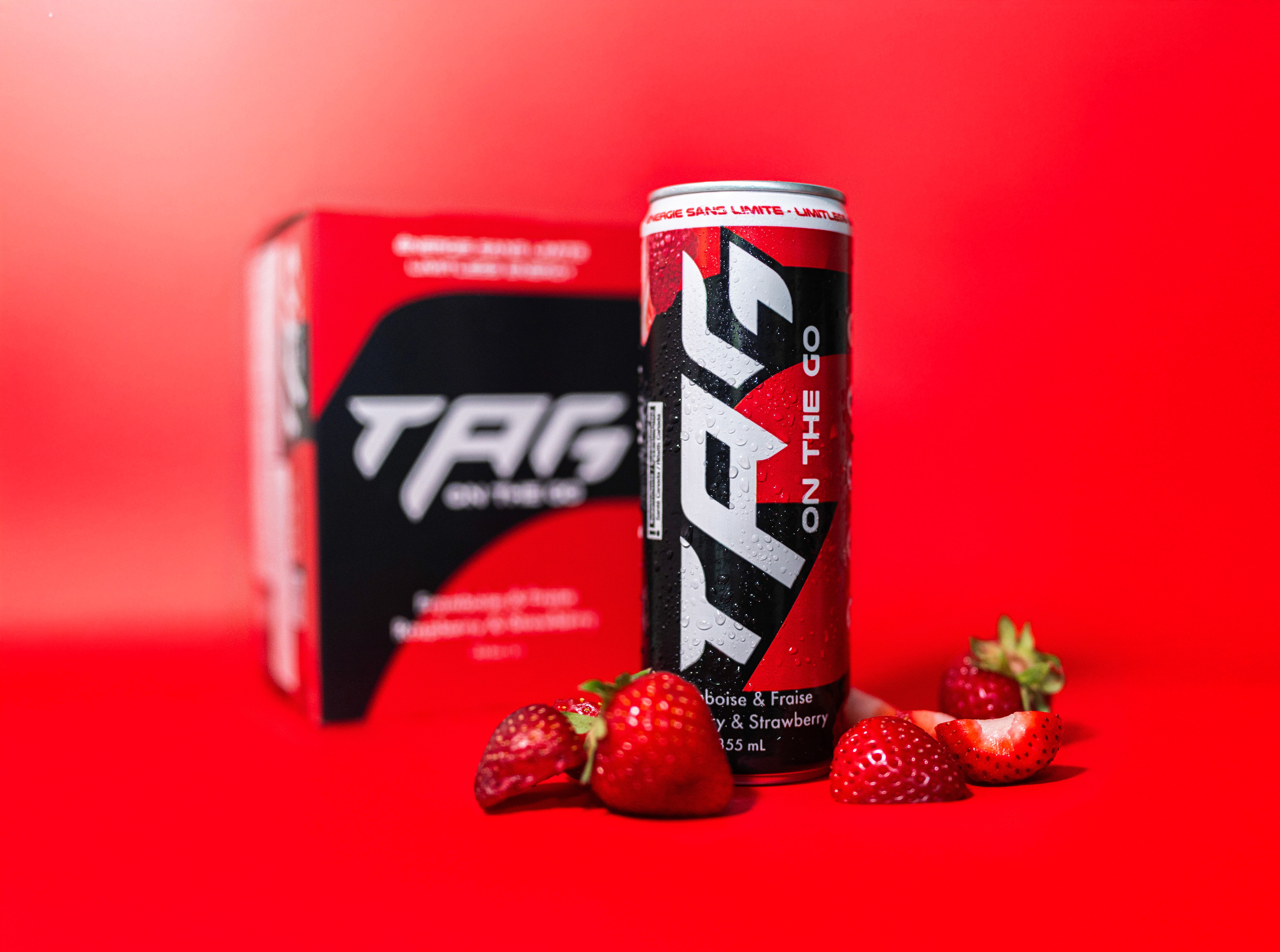
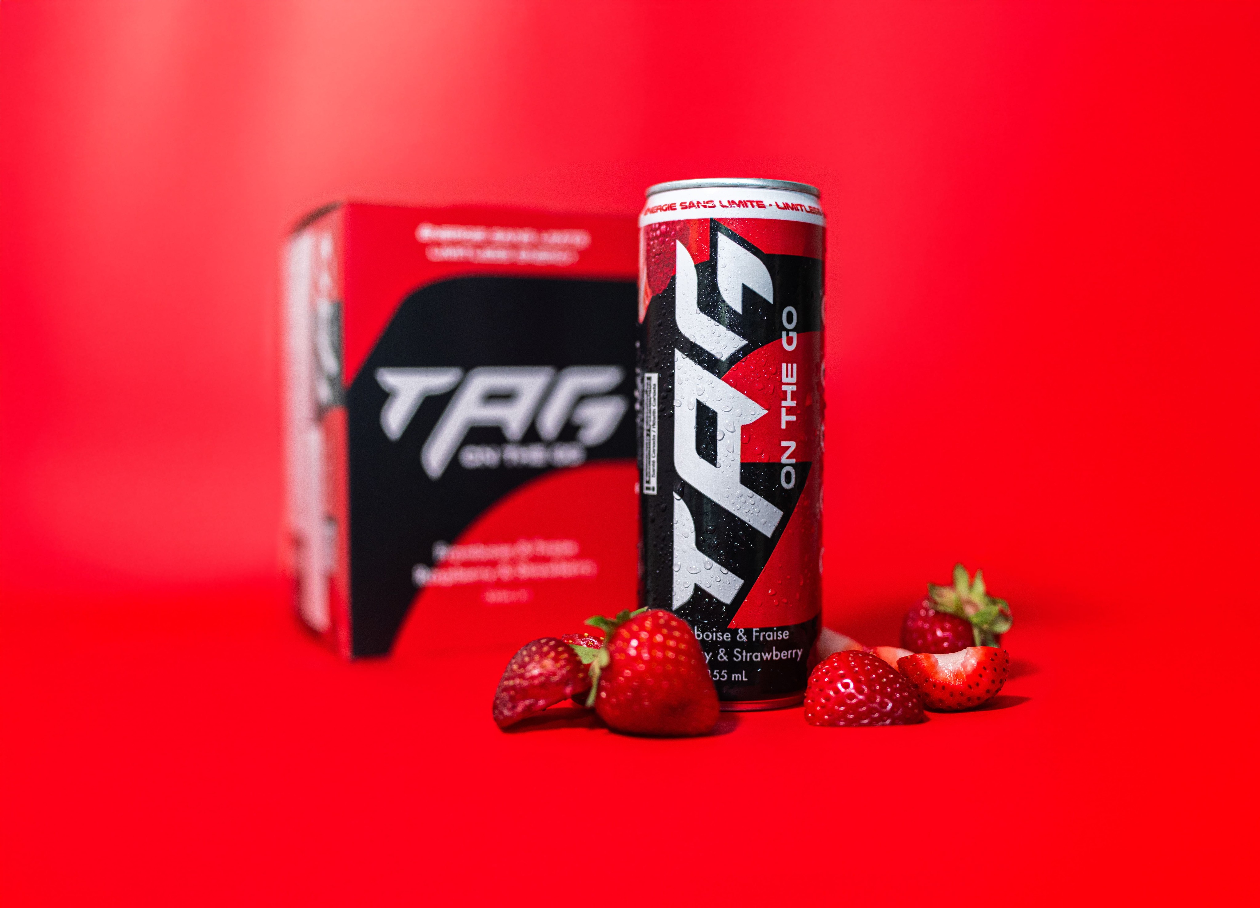
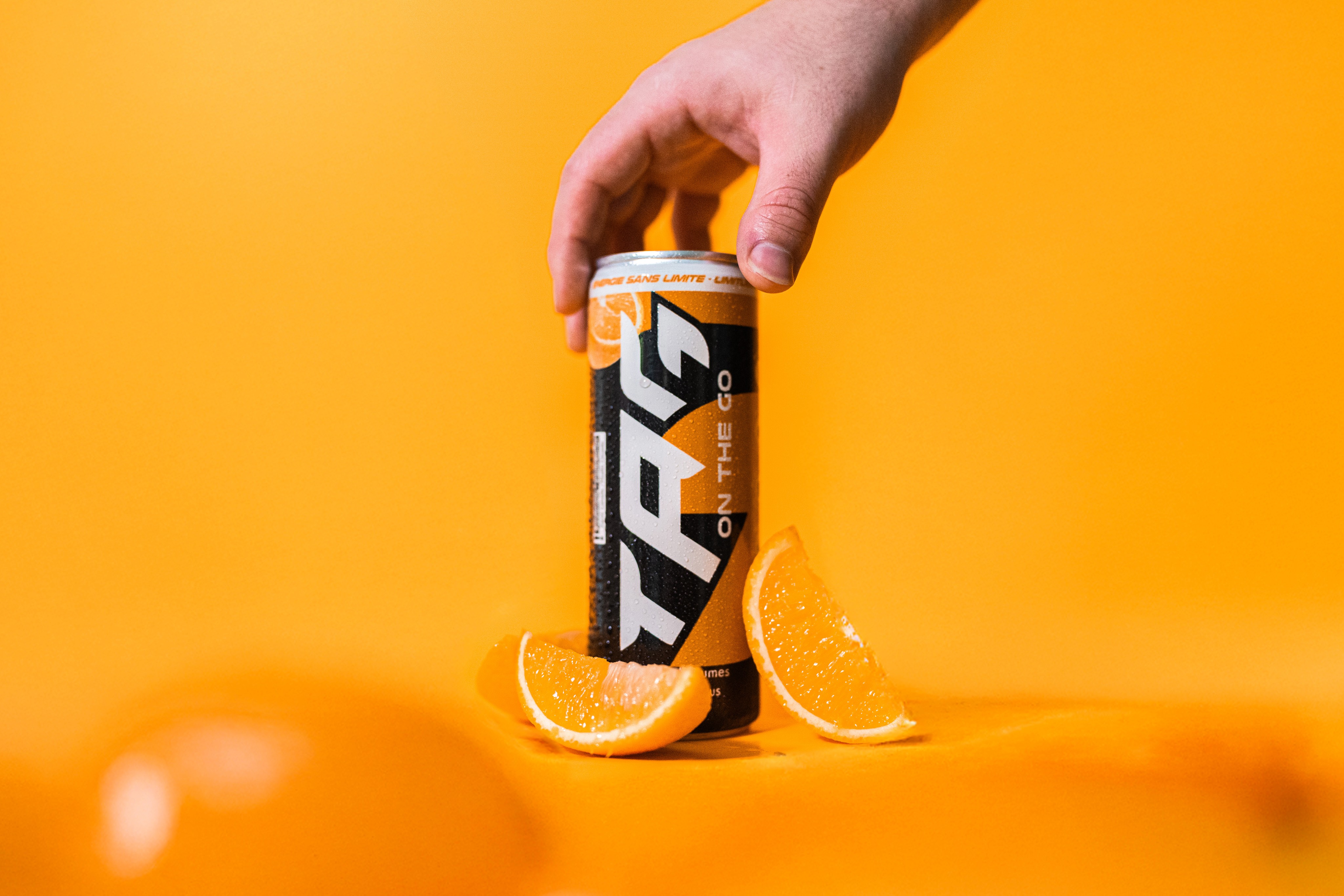
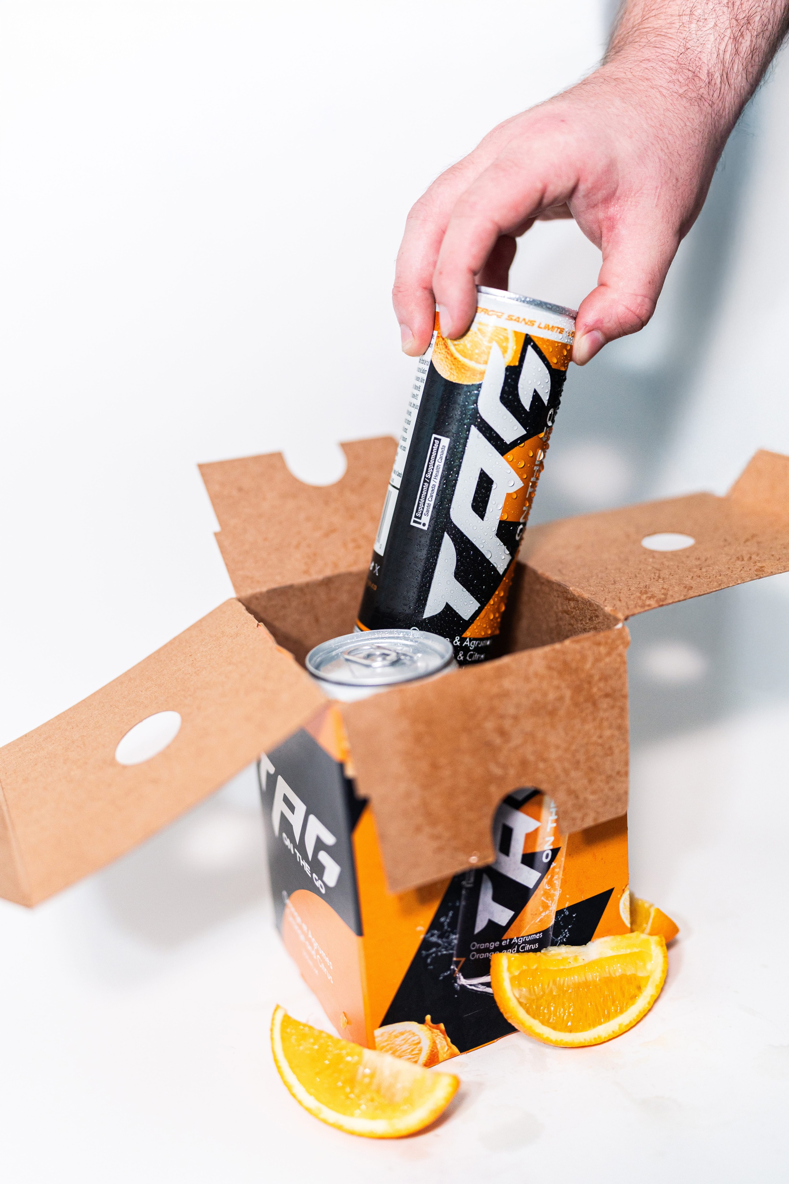
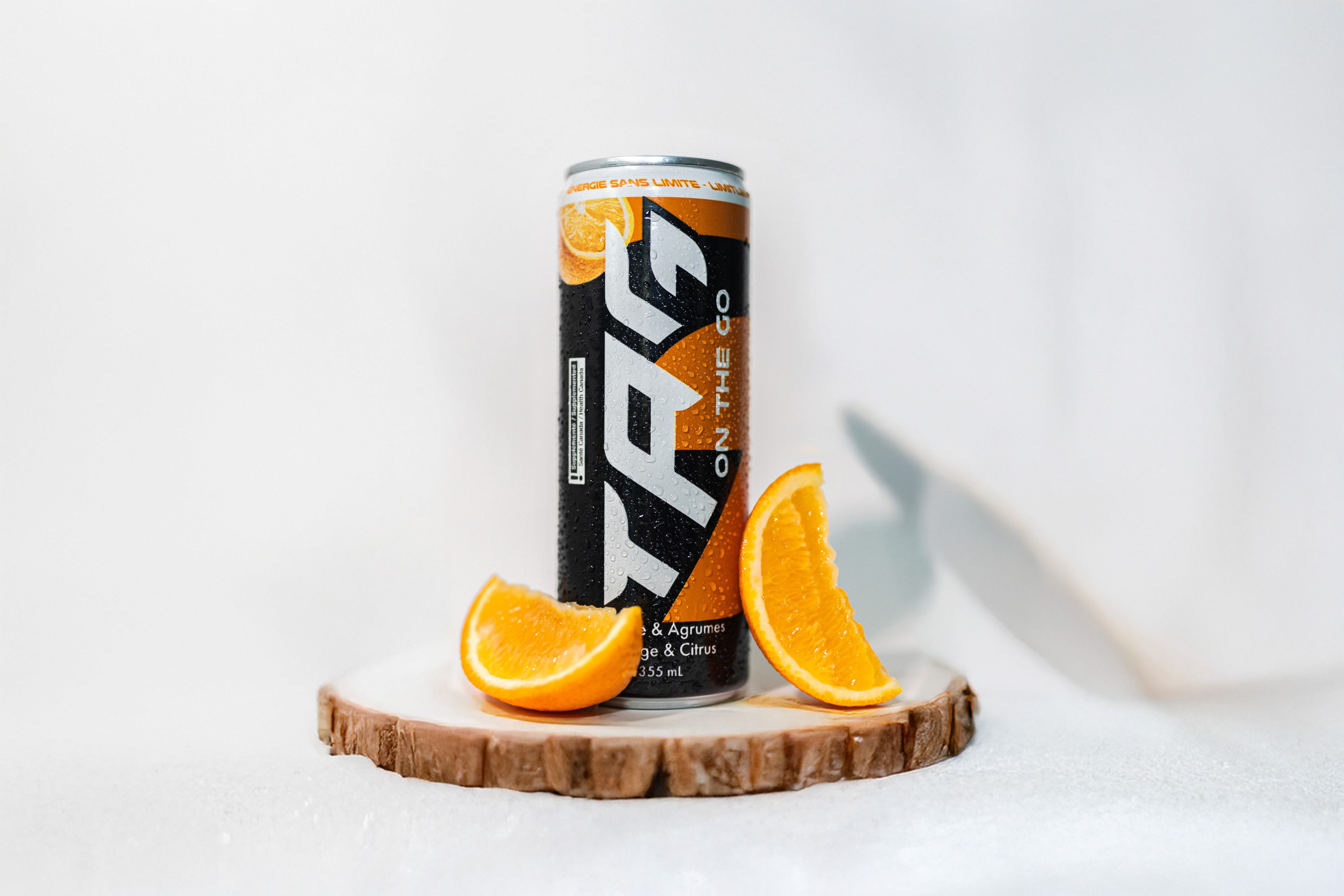
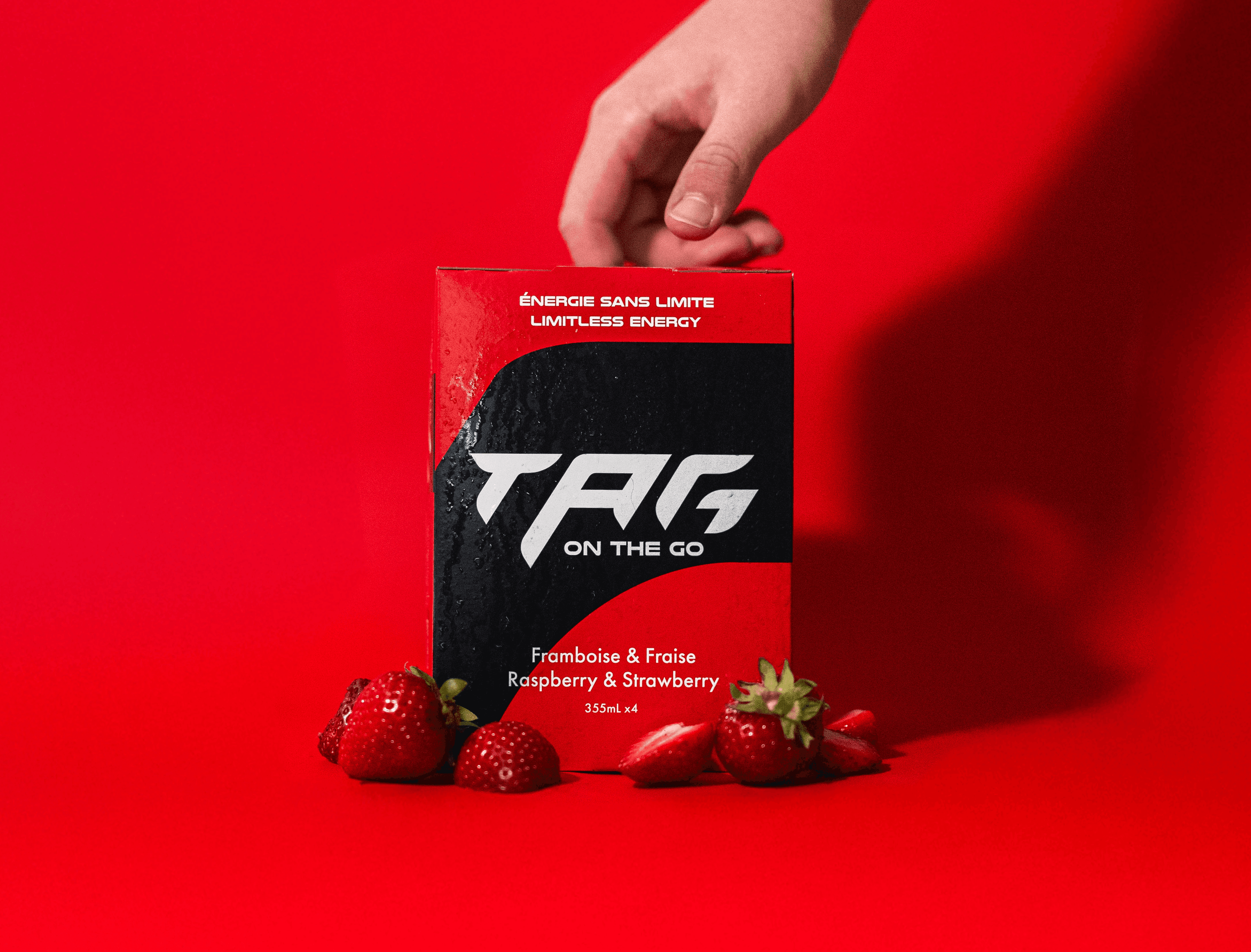
Our studio photography completes the visual identity, featuring the product in striking corporate-style shots against bold colored backgrounds. These images bring the brand to life, becoming a cornerstone for social media and other marketing designs. Together, the typography, colors, and imagery create a cohesive and impactful identity, ensuring Tag On The Go is ready to fuel its audience with both style and substance.

Tag On The Go’s branding combines bold typography, vibrant colors, and striking photography to capture its energy and precision. Nulshock Bold adds speed and modernity, while Futura PT Medium ensures clean, versatile readability.The red and orange palette reflects passion, vitality, and dynamism, aligning with Alex Tagliani’s active lifestyle and the brand’s high-energy ethos. Studio photography showcases the product in bold, corporate-style shots, reinforcing its dynamic identity. Together, these elements create a cohesive, impactful brand ready to inspire and energize its audience.

IMAGERY

IMAGERY

Imagery: Bold, Corporate, and Impactful


Imagery: Bold, Corporate, and Impactful


The imagery for Tag On The Go was meticulously crafted to reflect the brand’s dynamic and professional identity. Shot entirely in our studio, the product photography showcases the energy drink can against vibrant, colored backgrounds, creating striking visuals that emphasize the brand’s bold and energetic personality.

These super corporate-style images serve as the foundation for much of the brand’s social media presence, delivering a clean and polished aesthetic that resonates with both active individuals and professional audiences. By focusing on high-quality studio photography, we ensured every shot aligns seamlessly with the brand’s mission, making the visuals as impactful as the product itself.

Blue

Monday

Blue

Monday

Blue

Monday

Tone of Voice: Energizing and Engaging
Communication


Tone of Voice: Energizing and Engaging
Communication

In every interaction, SkriptPC's tone of voice embodies the vibrant energy and unwavering dedication that defines the gaming community. With a blend of enthusiasm, expertise, and authenticity, we speak directly to the hearts of gamers, igniting their passion and fueling their excitement for the world of esports and gaming.

Bold and Confident:

The tone of Tag On The Go speaks with boldness and clarity, reflecting the brand’s energetic and performance-driven ethos. It’s a voice that inspires action and motivates individuals to push boundaries, capturing the confidence of a brand fueled by speed and ambition.

Warm and Personal:

While bold, the tone also remains approachable and chaleureux—reflecting the personal connection with Alex Tagliani and the brand’s emphasis on health and well-being. This warmth ensures every message resonates on a human level, fostering trust and connection with the audience.

Dynamic and Adventurous:

Infused with a sense of motion and excitement, the tone embodies the thrill of the race and the joy of living an active lifestyle. It’s about inspiring individuals to embrace adventure, whether in sports, work, or their everyday lives.

Professional and Polished:

Behind the energy and warmth lies a professional foundation. Every piece of communication is clear, well-structured, and polished, ensuring credibility and aligning with the corporate visuals of the brand. This balance solidifies Tag On The Go as a trusted choice in the energy drink market.

Get exclusive access to new products, tips and more - subscribe to our newsletter today!

©2023 Agence Ridge S.E.N.C

Get exclusive access to new products, tips and more - subscribe to our newsletter today!

©2023 Agence Ridge

Get exclusive access to new products, tips and more - subscribe to our newsletter today!

©2023 Agence Ridge